


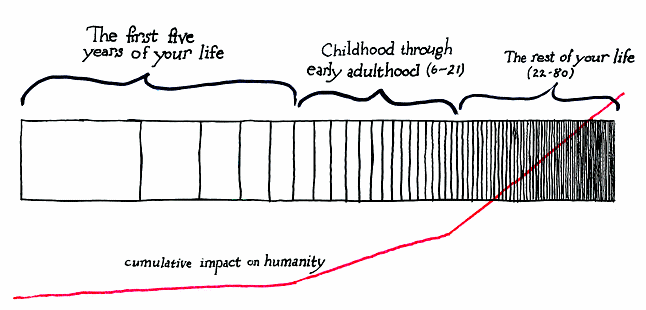
This is a graph of an eighty-year life. Each slice represents one year.
The slices’ sizes are weighted by what percentage that year represents of the whole lifespan to that point. At age one, the first year represents 100% of your whole life, so it is given a width of one hundred. Your second year is given a width of fifty, since it represents 50% of your life at age two.
By the time you get to age 21 and look back on the last year, you find that year 20 represents only 4.8% of your life. Furthermore, because each additional year represents a smaller relative portion of your life, three quarters of your life is already over. This is why time seems to go by more quickly as you get older.
In an attempt to offset the depressing nature of this visualization, I have added an unscientific representation of your potential cumulative effect on humanity, good or bad, as your life progresses. This is purely a function of your increasing ability to affect other people in (1) more areas of life and (2) within ever-widening physical bounds as time goes on, combined with the generational effects of your influence on others’ contact with people in their lifetimes.
—JD
“In theory, there is no difference between theory and practice; in practice, there is.” — Chuck Reid
This is a correlation to the “life is like a roll of toilet paper” idea that my Dad used to quote fairly often (well, about as often as everything else profound he “said”). I say quote – because the way he said it and the twinkle in his grin made me suspicious that he had heard it from someone else at least as clever. […] The diminishing diameter of a roll of toilet paper as it is used means each succeeding revolution yields fewer and fewer square inches of useable surface. So unless you figure out how to use less and less toilet paper as the roll gets smaller, it will go faster.
— Tim Dueck ·
This graph was used in a video titled How Old Can We Get (relevant section starts at 2:53), which was uploaded in October 2011 and as of this note has more than 1.6 million views.
— Joel Dueck (Author) ·
Maximilian Kiener recently created a beautiful interactive visualization of this concept — and gave us a great little window into its history, to boot.
On his site, Kiener states “This theory was first put forward by Paul Janet in 1897” but does not directly offer a source. This piqued my curiosity, so I emailed Kiener to ask about it. He very kindly replied that he had read it in an article by Steve Taylor for New Dawn Magazine: The Speed of Life: Why Time Seems to Speed Up and How to Slow it Down. Taylor writes:
He also quotes Janet as saying:
Taylor is quoting from chapter 15 of William James’s The Principles of Psychology, which in turn gives the source of the Janet quotes as the Revue Philisophique, vol III p. 496.
— Joel (Author) ·